Magazine Advert:
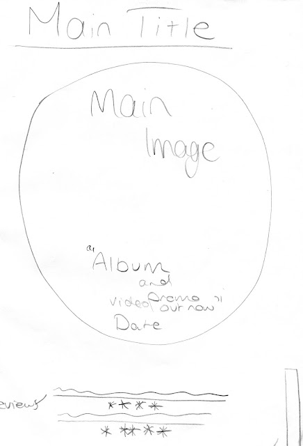
Written Draft: This is a brief outline of what I would like my magazine advert to include.
The advert above is the sort of google mock up version that I produced in Photoshop before I found out that only original images could be used. While making my second draft I kept the original aspects of the advert apart from the "The Debut Album..." as it is not very conventional of music magazine adverts. I deleted the image of the deer, the mandala and the mandala outline in the background as they were from google, I have kept the social media and music sharing logos however, because this shows where the album and promo video will be advertised and where the song can be listened to.
I gave a review from two music magazines; I used NME as they often review indie bands and their music, e.g. Kasabian's Empire Album.
Thursday, 23 February 2017
Wednesday, 22 February 2017
21. Codes and Conventions Analysis of the Ancillary Texts
Language: The colours of the digipak are all black and white, this reflects bands music as some of the music and lyrics are very dark but then other songs are more upbeat with lighter lyrics, this is fairly conventional of indie albums, another similar example of this would be Arctic Monkeys' album "Whatever People Say I Am, That's What I'm not". Everything in the digipak is centered; nothing is placed on the side of a page or disk which is often used on album covers and digipaks but it isn't typical of the indie genre. The use of the neon lights around the signs represent and link to the subtle electronic sound that they work into the indie rock sound that they play.
Institution: There are 4 record labels behind The 1975; these are Dirty Hit, Vagrant Records, Insomniac/Interscope Records and Polydoor Records, these are all independent labels. Dirty Hit's distributor however is Universal Music Group, so it keeps its independent form, keeping its demographic
Ideologies: The genre of the band is indie and with the use of the all black and white, the digipak is very in-keeping with the modern indie scene. This also matches the bands dress style too as they wear black and dark clothing.
Audience: The 1975's audience is a similar target audience to Brother Be/my created band, the target age is from mid teens; around 15 or 16 year old to ages up to around 20-23. It is, however, hard do describe the demographic of the The 1975's target audience as a lot of different classes of indie groups listen to them, for example, in the reality show Made in Chelsea the sound track often includes their music and this is often chosen by the people that make and star in the show; upper class people who are part of the B and A bracket in the social demographic, however, I, and people I know, also listen to the 1975 and would/have been to their gigs, are a part of the D/E demographic.
Representation: I think this digipak design represents simplicity as it, again reflects their music, it isn't complex, it is simple and to the point.
Language: With this album I think that simplicity is very important, the use of the plain white background was intentionally used to contrast from the bursting colours of the psychedelic era that The Beatles had already been through. The image of the band is also very simple and kind of typical of this genres album digipaks, pictures of a four piece band often appear in albums e.g Kings of Leon's Only By The Night Album, it features the bands faces in quarters mixed in with a bird. The writing on the disk and the disk design itself is very unusual
Institution: At the time of the release of this album , in the same year Apple Records was founded, by The Beatles themselves, by this time they had gotten so big that they owned there own record label meaning that they could produce what they wanted and distribute it how they wanted too and they chose this very simplistic way
 Ideologies: The ideologies behind this in my opinion could've been the fact that you don't have to be bright and vibrant to be good, as this was one of the most critically acclaimed albums they had and its facade shows it to be boring and dull with the use of black and white, however, the songs on the album are some of the greatest hits that The Beatles had, it gives a whole new meaning to 'don't judge a book by its cover'.
Audience: The audience for this particular album was a lot different in 1968 to what the audience of the modern pop equivalent albums are like now so to the audience of 1968 this would have been experimentally ground breaking especially being in the psychedelic era where everything had vibrant colours on it, it was very unconventional at the time to have simple album cover, but when The Beatles bring out the Vinyl cover for this with in all black and white, it must have attracted a lot of attention. In the modern day though things like this go pretty much unseen purely because simplistic is popular, its been done many times before and it is now a convention of modern indie rock album covers and album adverts.
Representation: I think this album represents individuality in the fact that when in and age of everything being mainstream and the same, its okay to stand out and be an individual doing what ever it is you want to do, and that meaning can be applied in present day right now.
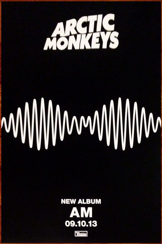
Language: The AM album is very simplistic with the main mage on the advert is actually taken from the video that they release from the song 'Do I Wanna Know?' this image of the sound wave reoccurs through the whole promotional package, from the music video to the album cover to the magazine advert. The conventions lie in the plain block colours of the AM album advert, very similar to that of the The 1975's digipak, there is a convention of simplicity arising in the indie genre. Kasabian's album however has a lot more going on, challenging this convention, Kasabian has opted for the reviews at the bottom of the advert, this is to show the better reviews from the biggest critics in order to make people want to buy this 'epic' album, these quotes are often the most exaggerated also. Both of the albums also show the convention of having the release date of the albums along with the institutions that they belong to.
Institution: Arctic Monkeys were and still are signed to an independent record label Domino Recording Company, as they have become more popular they have been signed by Warner Records, but probably only as a distributor of their albums etc. Kasabian are signed by are signed by some of the biggest record companies however, Sony Music in partnership with RCA Records, Columbia Records and Sony BMG. This could be the reason for the difference in detail on the album adverts as it could suggest that because AM are signed to an independent label they like to do things by the book and simplistically and because a larger label is behind Kasabian they may be pushing them to make more impressive products.
Ideologies: The ideologies of the Arctic Monkeys advert could be that the sound is everywhere and the fact that it's sort of in the shape of a face it suggests that music is always with you. The ideologies of the Kasabian advert could say that they possibly think of themselves as kings, seen from the use of the K from a playing card, the use of the naked lady in the king's arms suggest their perception of themselves.
Audience: Fans of the mainstream indie genre would be the audience for these particular bands, there new attitude towards the indie genre has changed the indie audience, in some ways it has almost been more sexualised - as seen by the naked woman on the Kasabian advert - the music is primarily about relationships etc, a good example of sexualising the genre would be 1975, their songs are almost all about sex, relationships and chasing girls. The audience for this and any genre really can relate to the themes that arise in the songs that are played in this genre, these themes are not only conventional of the indie genre but many other genres too.
Representation: In my opinion I think that the Kasabian advert represents gender, it presents stereotype of men being the saviors of the women and how the man sweeps the woman on her feet into his arms as a showing of strength and masculinity, I feel that because the genre is fairly male orientated with a lot of male singers, songwriters and bands that is is a fairly conventional representation throughout the genre.
Tuesday, 21 February 2017
20. Ancillary Brief
Subscribe to:
Comments (Atom)


