Tuesday, 11 April 2017





Monday, 10 April 2017
25. Evaluation Question 3: What have you learned from your audience feedback?
For this evaluation question I made am only presentation software, PowToon, due to technical difficulty I was not able to upload the presentation as an embedded file like I am able to with Prezi presentations, however, I have exported the presentation to YouTube and have embedded the video into Blogger for this post.
After getting more feedback on my evaluation I was told that I should go into more detail on how I improved my products after my feedback.

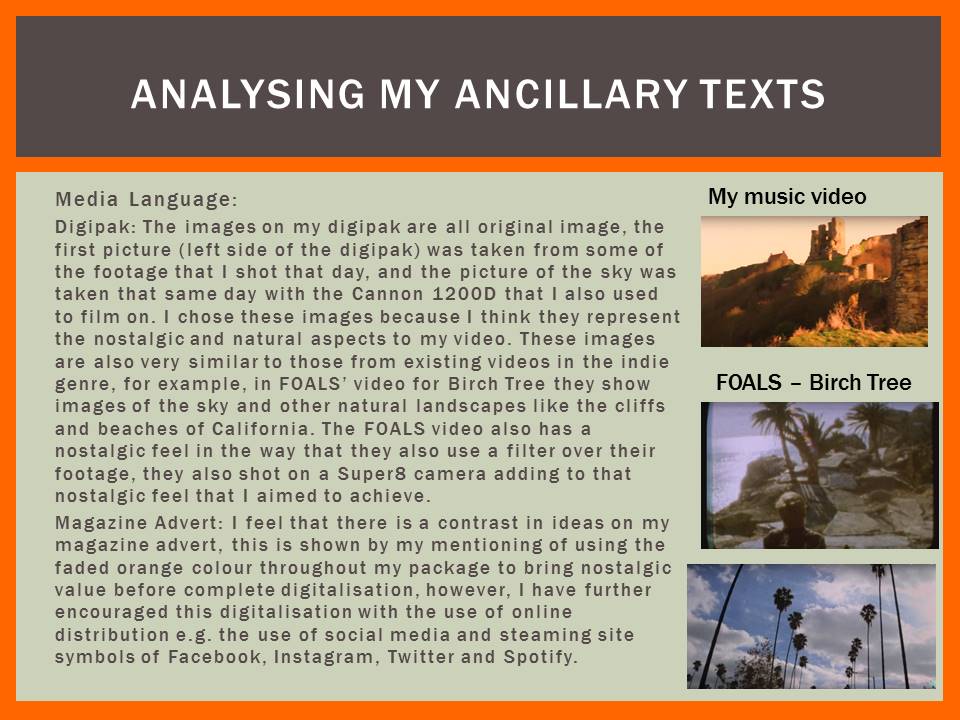
This is the first draft of the music video before the feedback that I got regarding it, I improved the video by adding more transitions, slow motion editing and footage in order to further plot and give a rough narrative
This is the final edit of my music video after the improved editing and narrative
After getting more feedback on my evaluation I was told that I should go into more detail on how I improved my products after my feedback.

This is the first draft of the music video before the feedback that I got regarding it, I improved the video by adding more transitions, slow motion editing and footage in order to further plot and give a rough narrative
This is the final edit of my music video after the improved editing and narrative

Thursday, 9 March 2017
22. DigiPak Drafts


9/03 This is what my DigiPak looks like without any of the found images on. This is what I will now work from when forming the rest of my DigiPak using my own images.


The inspiration for my digipak style came from this album, I have obviously already changed the style quite a lot more as I have added a colour album title and I have also used black pages, in contrast to this album as every page is white.
This album by The Beatles challenges many conventions of Album covers; the albums track lists are located on the disks themselves, this is unconventional but also fairly impractical as one might want to choose a song but the disk would be in the CD player so the listener would be unable to see the track number of the song they want to play.


As You can see below, I have decided to change to colour scheme of my digipak, I have decided to use blue and orange, this would make the album stand out as the two colours compliment each other as they are opposites on the colour wheel.
In changing the colour scheme I had to also change the colour of one of my pictures, I have to use the magic selection tool to select the clouds and fill them in the colour that matched my scheme. I did the same with the discs, the tracklist and the title on the front cover.

Due to feedback from my peers and teacher on how the orange was standing out a little bit too much, in order to fix this I used the fill swatches on Photoshop and I toned it down to more subtle orange colour.

Thursday, 23 February 2017
22. Magazine Advert Drafts
Magazine Advert:
Written Draft: This is a brief outline of what I would like my magazine advert to include.
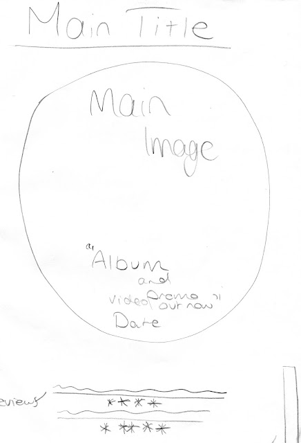

The advert above is the sort of google mock up version that I produced in Photoshop before I found out that only original images could be used. While making my second draft I kept the original aspects of the advert apart from the "The Debut Album..." as it is not very conventional of music magazine adverts. I deleted the image of the deer, the mandala and the mandala outline in the background as they were from google, I have kept the social media and music sharing logos however, because this shows where the album and promo video will be advertised and where the song can be listened to.
I gave a review from two music magazines; I used NME as they often review indie bands and their music, e.g. Kasabian's Empire Album.

Written Draft: This is a brief outline of what I would like my magazine advert to include.
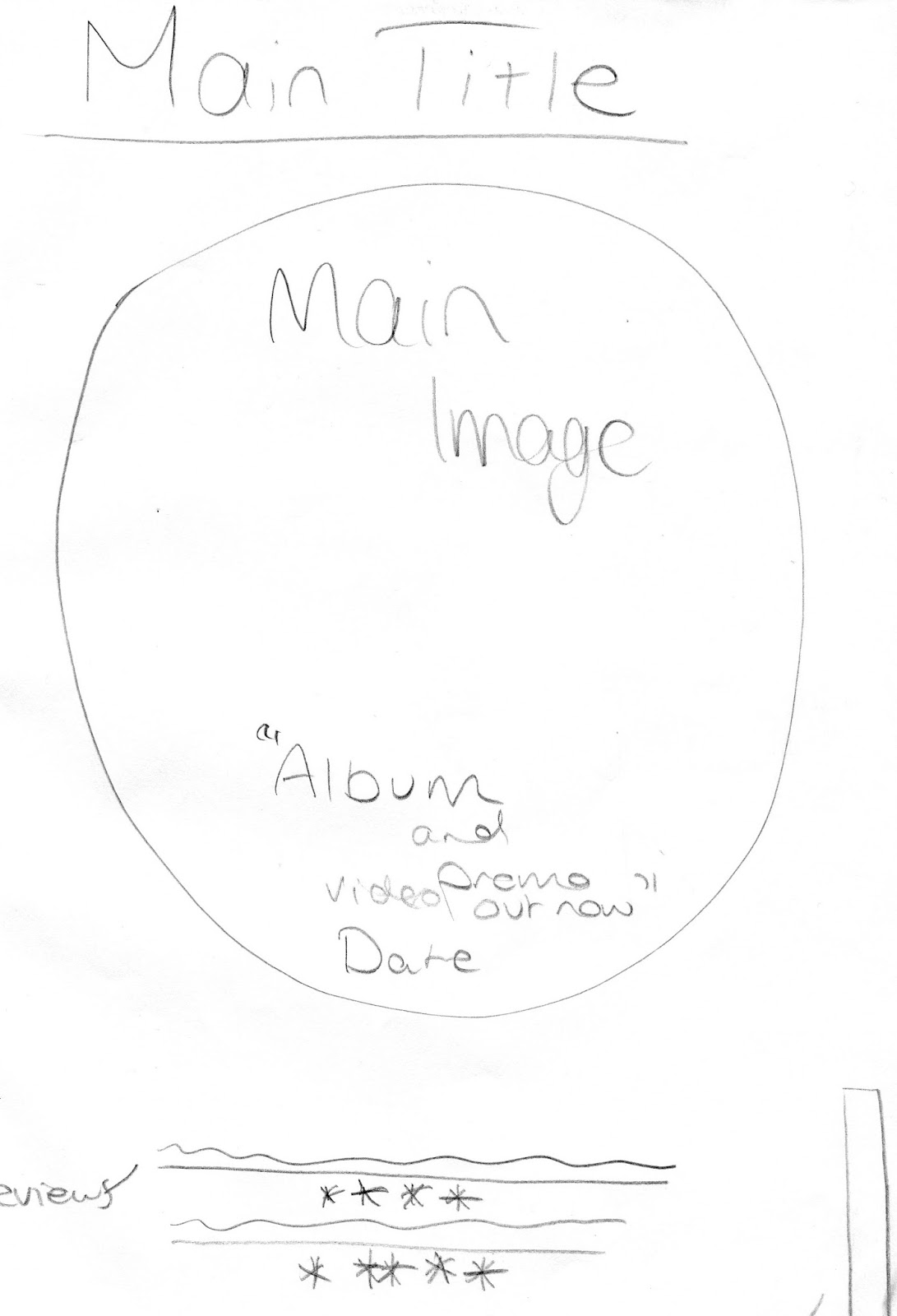

The advert above is the sort of google mock up version that I produced in Photoshop before I found out that only original images could be used. While making my second draft I kept the original aspects of the advert apart from the "The Debut Album..." as it is not very conventional of music magazine adverts. I deleted the image of the deer, the mandala and the mandala outline in the background as they were from google, I have kept the social media and music sharing logos however, because this shows where the album and promo video will be advertised and where the song can be listened to.
I gave a review from two music magazines; I used NME as they often review indie bands and their music, e.g. Kasabian's Empire Album.

Wednesday, 22 February 2017
21. Codes and Conventions Analysis of the Ancillary Texts

Institution: There are 4 record labels behind The 1975; these are Dirty Hit, Vagrant Records, Insomniac/Interscope Records and Polydoor Records, these are all independent labels. Dirty Hit's distributor however is Universal Music Group, so it keeps its independent form, keeping its demographic
Ideologies: The genre of the band is indie and with the use of the all black and white, the digipak is very in-keeping with the modern indie scene. This also matches the bands dress style too as they wear black and dark clothing.
Audience: The 1975's audience is a similar target audience to Brother Be/my created band, the target age is from mid teens; around 15 or 16 year old to ages up to around 20-23. It is, however, hard do describe the demographic of the The 1975's target audience as a lot of different classes of indie groups listen to them, for example, in the reality show Made in Chelsea the sound track often includes their music and this is often chosen by the people that make and star in the show; upper class people who are part of the B and A bracket in the social demographic, however, I, and people I know, also listen to the 1975 and would/have been to their gigs, are a part of the D/E demographic.
Representation: I think this digipak design represents simplicity as it, again reflects their music, it isn't complex, it is simple and to the point.
Institution: At the time of the release of this album , in the same year Apple Records was founded, by The Beatles themselves, by this time they had gotten so big that they owned there own record label meaning that they could produce what they wanted and distribute it how they wanted too and they chose this very simplistic way
Ideologies: The ideologies behind this in my opinion could've been the fact that you don't have to be bright and vibrant to be good, as this was one of the most critically acclaimed albums they had and its facade shows it to be boring and dull with the use of black and white, however, the songs on the album are some of the greatest hits that The Beatles had, it gives a whole new meaning to 'don't judge a book by its cover'.Audience: The audience for this particular album was a lot different in 1968 to what the audience of the modern pop equivalent albums are like now so to the audience of 1968 this would have been experimentally ground breaking especially being in the psychedelic era where everything had vibrant colours on it, it was very unconventional at the time to have simple album cover, but when The Beatles bring out the Vinyl cover for this with in all black and white, it must have attracted a lot of attention. In the modern day though things like this go pretty much unseen purely because simplistic is popular, its been done many times before and it is now a convention of modern indie rock album covers and album adverts.
Representation: I think this album represents individuality in the fact that when in and age of everything being mainstream and the same, its okay to stand out and be an individual doing what ever it is you want to do, and that meaning can be applied in present day right now.

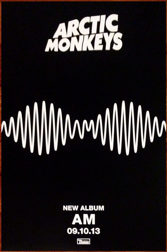
Language: The AM album is very simplistic with the main mage on the advert is actually taken from the video that they release from the song 'Do I Wanna Know?' this image of the sound wave reoccurs through the whole promotional package, from the music video to the album cover to the magazine advert. The conventions lie in the plain block colours of the AM album advert, very similar to that of the The 1975's digipak, there is a convention of simplicity arising in the indie genre. Kasabian's album however has a lot more going on, challenging this convention, Kasabian has opted for the reviews at the bottom of the advert, this is to show the better reviews from the biggest critics in order to make people want to buy this 'epic' album, these quotes are often the most exaggerated also. Both of the albums also show the convention of having the release date of the albums along with the institutions that they belong to.
Institution: Arctic Monkeys were and still are signed to an independent record label Domino Recording Company, as they have become more popular they have been signed by Warner Records, but probably only as a distributor of their albums etc. Kasabian are signed by are signed by some of the biggest record companies however, Sony Music in partnership with RCA Records, Columbia Records and Sony BMG. This could be the reason for the difference in detail on the album adverts as it could suggest that because AM are signed to an independent label they like to do things by the book and simplistically and because a larger label is behind Kasabian they may be pushing them to make more impressive products.
Ideologies: The ideologies of the Arctic Monkeys advert could be that the sound is everywhere and the fact that it's sort of in the shape of a face it suggests that music is always with you. The ideologies of the Kasabian advert could say that they possibly think of themselves as kings, seen from the use of the K from a playing card, the use of the naked lady in the king's arms suggest their perception of themselves.
Audience: Fans of the mainstream indie genre would be the audience for these particular bands, there new attitude towards the indie genre has changed the indie audience, in some ways it has almost been more sexualised - as seen by the naked woman on the Kasabian advert - the music is primarily about relationships etc, a good example of sexualising the genre would be 1975, their songs are almost all about sex, relationships and chasing girls. The audience for this and any genre really can relate to the themes that arise in the songs that are played in this genre, these themes are not only conventional of the indie genre but many other genres too.
Representation: In my opinion I think that the Kasabian advert represents gender, it presents stereotype of men being the saviors of the women and how the man sweeps the woman on her feet into his arms as a showing of strength and masculinity, I feel that because the genre is fairly male orientated with a lot of male singers, songwriters and bands that is is a fairly conventional representation throughout the genre.
Tuesday, 21 February 2017
20. Ancillary Brief
Thursday, 15 December 2016
19. Music Video First Draft and Audience Feeback
Audience Feedback:
I have recieved a fair amount of feedback from members/fellow students in the media department.
One person said that the casting of the couple was a good idea and matched well with the tone of the song. They also said that I should attempt fixing the amount of Camera Wobble.
I also wrote down feedback from a member of the Media Department itself, below are his suggestions of what to change in my video:
- Add a dissolve into the 4th frame
- Add 'home movie' style filter to the footage in the timeline
- Cut the shot of walking from behind as it doesn't promote anything
- Edit the close up of the waves into slow motion
- Edit the some of the walking into slow motion
- Dissolve the walking and standing shots
- Cut the shots with a lot of wobble
- Reverse/flip the 'car shot'
- Create a slow motion motif by adding more in
This person also suggested an idea that I should create a sort of walking montage within the film in order to give my video stages to make it less dull in the middle. We have edited the video in order to make it less dull also using more fades and dissolves to smoothen out the editing making the cuts less harsh and sudden, I feel that this also reflects the tone of the song we chose as it is fairly slow and calm.
Thursday, 1 December 2016
16. Health and Safety Assessment

This is the risk assessment table that I completed, it goes through possible situations/hazards that could put the different people on the set of the music video in danger and gives a sensible action that could be made as precautions in order to come out with a solution to that hazard.
Sunday, 20 November 2016
15. Mise-en-Scene: Casting, Location, Costume and Props of my Music Video
Props: I was not planning on including any props into my film as it is very candid and I want it to feel like it is being stripped bare without adding layers and layers on mise-en-scene so to speak.
Location: The location that I picked for my music video was the cliffs and seafront of Scarborough's North and South Bay. I chose this location because it is where I used to go as a child, so I knew the area for one but also it has sort of meaningful personal value to me and so does the song so I knew filming a 'day in the life' style of video here would fit and also motivate me because its what I want to do and where I want to film it.
Costumes: The costumes for my music video will be typical modern indie rock, i.e. a lot of denim, black jeans, Vans shoes etc. The couple that we have chosen to cast in our music video already style themselves in the indie fashion so this makes it slightly easier in terms of costume as it will be their own clothes. Below are examples of a male and a female modern indie rocker, this is the style that my music video's costume/aesthetic will be modeled around.

http://s3cdn-lookbooknu.netdna-ssl.com/files/looks/large/2012/03/16/2031145_INDIE_048.jpg?1331923396

https://s-media-cache-ak0.pinimg.com/736x/42/74/32/4274320ed99bbdbf2250182a5ee7dbe4.jpg
Cast List:
- Male in couple Matty Laws
- Female in couple Nellie Buttifant
Saturday, 19 November 2016
Tuesday, 15 November 2016

Monday, 7 November 2016
12. Lyrics, Lyric Analysis and Lyric Timings
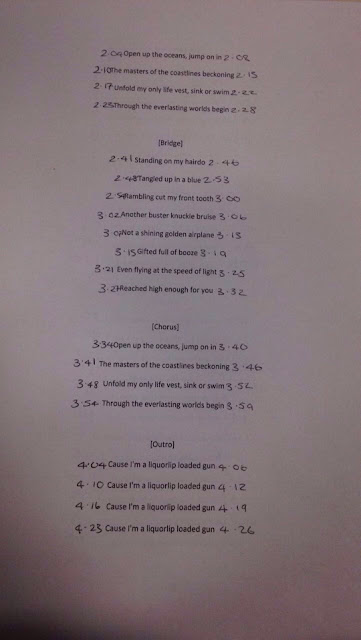
Firstly the title 'Liquorlip Loaded Gun' suggests some relation to alcohol abuse and how maybe in a drunken state the lead singer may abuse/hurt others around him. I feel that the lyrics reflect this perception quite well, I also feel that love is a fairly major theme in the song too.




Saturday, 5 November 2016
11. Defining My Audience
The audience that I would say this particular band would be targeted at is aged around probably 16-25 for a general range, but also suitable for people 25+. The type of audience that I would want to attract is the sort of audience that go to gigs, not necessarily large/arena gigs all the time but more intimate rock/indie rock gigs, sort of in an underground music scene not known to most of the mainstream public. The video for our band would probably not be shown on popular music television stations like MTV, VIVA or even KERRANG! YouTube would be the main place to watch the music video. The style of my audience will be sort of modern indie, i.e. ripped black jeans, leather or denim jacks, Vans etc.
Mood Board:


The social demographic that I would be targeting would be D: the working class of unskilled manual workers and E: the casual/lowest workers.
Class D: I would target this class as it usual consists of people in their late teens to early 20's that do sort of manual jobs. Indie bands like Blossoms and Catfish and The Bottle men don't charge that much for tickets to their gigs, this is what Brother Be would be like.
Class E: I have targeted this demographic for the same reason as they do not necessarily make large amounts of money and the fact that my band is an indie band means that they would not charge huge prices for gigs, albums, merchandise etc.
This is the sort of demographic to be constantly listening to indie music on their iPhones, iPods or on Youtube, also looking for the next gig to watch by the next up and coming indie band, drinking in traditional pubs, drinking draft beer like Carling, Coors and Ales like Black Sheep or Punk IPA. Their jobs may not me the highest paying jobs e.g. bricklaying, contracting, joinery and even students. Students would probably be the biggest part of the demographic for my band and products, students spanning from college/sixthform to university. The student life is suitable to this as most indie bands now are used on music sharing apps like Spotify and Apple Music, both of which have a discount price for students with student cards or NUS. Fashion would be fairly important to my target demographic as the new style of indie fashion looks for new more outrageous ways to state ones individuality through clothing, this is ofte reflected in the music that some bands make also.
Subscribe to:
Posts (Atom)